Introduction
With any kind of photography, there are at least two steps: capturing the image, and then processing that image to make it match what you want to show the world. In this post, I'm going to be talking about the second part of that process as it applies to a very particular context: fire photography.
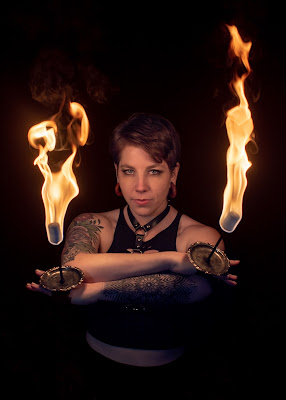 |
| Erin with her palm torches. |
How you edit your fire photos is at least as important as how you shoot them, especially since there are so many subjective ways to portray them. I have a particular style, and I'll be catering this post towards that style, but the items I'm going to talk about should be useful for any other style as well, and even to photography in general. I don't expect this to be "The final word" on how to edit photos of fire performers, only a starting point; if you want to take your style in a different direction, you absolutely should, and hopefully what you learn here will help you do that.
If you haven't already read Part One in this series, I highly suggest that you do so; this post will make a lot more sense once you do. Also, I'll be assuming that the reader is using Adobe Lightroom or a comparable software suite for the edits. I know a handful of tricks for Photoshop and other software suites, but not nearly well enough to be writing 'blogs about.
Your Friend The Histogram
Histograms are a mathematical way to plot the frequency of occurrence within a given dataset. The higher the value of the histogram plot, the more frequently data points occur around that value. Within the context of photography, histograms are often used to determine how much of your image is dark (the left edge of the plot), how much is white (the right edge of the plot), and how much is "in between". (There are also separate histograms for each of the three different color channels, but I won't get into that here.)
Here are two examples; the greyscale bar across the top is the image, the plot on the bottom is the histogram of that image.
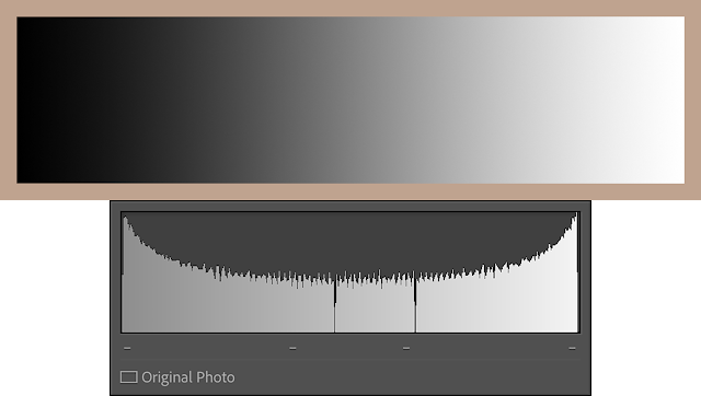 |
| Example One: Low Contrast. |
Example One is low contrast; its histogram starts off high in the blacks, gradually fades into midtones that are also relatively high, and then back up to high in the whites. This image would be said to have more tonal detail, and its histogram is relatively uniform; the ends are a bit higher than the middle, but not severely so.
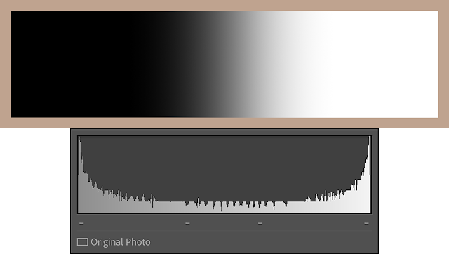 |
| Example Two: High Contrast. |
Example Two is high contrast; it has a much more abrupt transition from black to white, with very few midtones in between. This photo won't show nearly as many shades of grey in between as the first one. This image would be said to have less tonal detail, and its histogram is all bunched up at the edges.
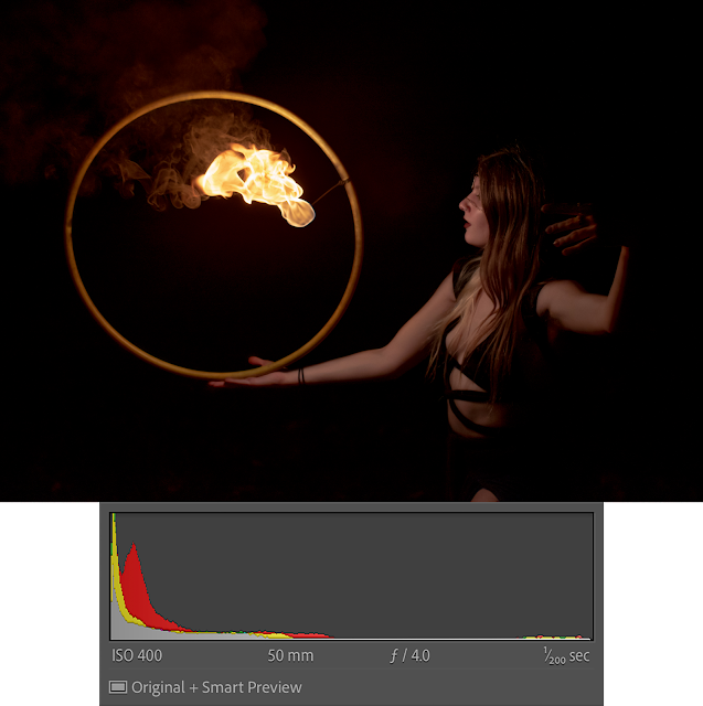
When photographing fire performers, the RAW images out of your camera will often look like Example Two with a lot of your image bunched up at either end, or all bunched up at one end or the other. Spreading this histogram out in order to produce enough tonal difference to see lots of detail is the basis of the concept I call contrast management, and I'll be referring to it throughout this post.
The Mark I Eyeball
Something that needs to be kept in mind for most photography, but particularly for fire photography, is the fact that the Mark I Human Eyeball does not respond to light the same way that digital sensors do. Human eyesight is logarithmic, but digital sensors are linear.
Because I can't think of how to visualize this in a digital photo, here's a virtual example: pretend you're in a dark room, lit only by a single candle. If you were to add a second candle, things would look brighter to your eyes because you've just doubled the available light. Now, start over with ten candles in the room instead. If you were to add an eleventh candle your eyes almost certainly wouldn't notice it, even though you added the same absolute amount of additional light. With the human eye, it's the relative change of light that we notice, not the absolute change.
Now replace your eyes with a digital camera in both of those scenarios. In both situations, the camera will simply register one more candle's worth of light. Why? Because digital sensors (for the most part) respond to the absolute change of light, not the relative change*.
This is why contrast management is so important; our eyes won't notice fine details without enough of a change between them. I'll refer to this as tonal separation. If your image histogram is all squished up in the shadows and highlights with nothing in the middle, our eyes won't see much, even if your camera or computer do. As a photographer, you need to make sure that the things you want your viewer to see are spread out as much across the histogram as possible.
Signal-to-Noise-Ratio
I nearly mentioned this in Part 1 since it can impact your camera settings, but that post was already way too long and it will also impact how you edit. There are long and detailed discussions to be had about the finer points of ISO invariance and how digital sensors work, but one key concept that will help to understand in this context is signal-to-noise ratio (or SNR).
Any digital sensor produces electronic noise. That sensor can produce a useful image any time the signal that sensor collects is sufficiently above that noise level. Higher end digital cameras will let you boost your shadows and still retain detail because they have extra noise reduction wizardry built-in, but if your signal is not much higher than your noise, if your signal-to-noise ratio is too low, you will have an exceptionally hard time recreating any useful image regardless of how good your camera is.
If the dynamic range of your camera is your upper limit to clipping your highlights when photographing fire performers, the SNR of your image is the lower limit to being able to boost your shadows**. These two quantities define how much you can stretch out your image histogram and still produce a good photo.
 |
| Closeup of shadows boosted way too far showing signs of low SNR noise. Ick. |
A too-low SNR will become apparent in edits as noisy or downright ratty shadows that you're trying to boost. It is similar to high-ISO noise, only it looks worse (at least to me). Colors get lost, details get blurry, and visible pixel-to-pixel noise starts to dominate the affected area. Chances are you're just better off setting that area to black and moving on.
It's important to note that, while dynamic range is a property of an camera, SNR is a property of an image. This matters because you can influence it while taking photos. If you find that your shadows are too noisy while you're editing and you don't necessarily want to just leave them dark, you'll need to either add more light to your scene or increase your camera's sensitivity by boosting its ISO in future shoots. Just be aware that boosting your ISO too far will produce noise of its own.
Contrast Management
Back to contrast management.
In Lightroom, there are generally three ways to adjust the contrast of an image: the contrast slider, the levels sliders like highlights and shadows, and tone curves.
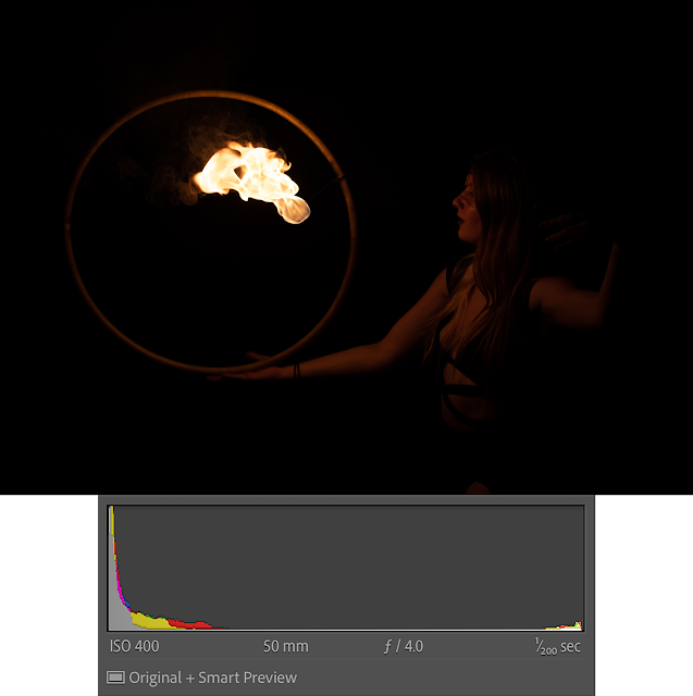 |
| Rachel, straight out of camera. Notice how the histogram is bunched up at both ends. |
The contrast slider is a blunt instrument: handy for making coarse top-level adjustments, but with no provision for fine detail and having only a limited adjustment range. It's a good place to start, but you probably won't want to finish here. I'll start off a lot of my edits with the contrast slider set to -25 or -50 and adjust as I go along. Rarely, if ever, will you want positive values for these kinds of edits.
The levels sliders are a screwdriver: better for making fine adjustments, but potentially requiring a lot of tweaking. Boosting your shadows and reducing your highlights can produce very similar results to simply bumping your contrast slider to the left, but with more control. I'll start off a lot of my edits with -50 on highlights and +50 on shadows and go from there.
 |
| Same image as above with adjustments to contrast and levels (and exposure & white balance). The histogram is much more spread out. |
Tone curves are a set of scalpels: very precise, very powerful, but also able to wreck an image with one wrong move. My first group fire shoot from 2021, which I was generally happy with at the time, all ended up a bit too contrasty for my taste now, a year later, because I slightly abused the tone curve.
In order to maximize the amount of tonal detail that your edited photo will have, you want to make sure that you take full advantage of the histogram; you want your blacks to be black and your whites to be white. If your darkest value is, say, 25% grey, you've lost a lot of potential contrast.
A Word About Masking
Often times I find myself wanting to boost shadows in some places (like on a performer) but not others (like in a background). While I'm certain that there are other ways to do this, I'm a fan of masking, especially after Adobe updated Lightroom to include the "Select Subject" feature.
I will use masks liberally. I tend to do scene-wide adjustments based on the fire because selecting flame and smoke accurately can be difficult, so I will often mask out the performer(s) in the scene in order to adjust them independently. You could also do scene-wide adjustments to your performers and mask out the fire if you wanted, but I've not had much luck with this barring the few occasions where "Select Subject" ends up selecting the fire instead of the performer. (Yes, this does happen.)
 |
| Zahra, showing a mask in Lightroom on the left boosting highlights slightly. Smart choices in how you mask can make life easier. |
One trick that I've learned that lets me be a bit lazy with masking: only change values that impact the areas you're interested in. That way if your mask is a bit larger than your subject, you won't end up with an obvious "halo" around them. For example, look at the photo of Zahra above: I was clearly lazy with this mask and it extends into the black space around her. But since I'm only adjusting the highlights and there are no highlights in black space behind her, it doesn't show up in the final edit. If I had boosted exposure or shadows, there would have been an obvious and visually unappealing halo around her where my mask was.
Again, this is less of an issue with the newer subject selection tools, but anything that helps reduce workload is good.
White Balance
Something as simple as white balance is easy to overlook in some contexts, but here it is absolutely critical to producing pleasing images. If you rely on your camera's auto white-balance alone, chances are that your images will end up washed out in a sea of oranges and yellows. This isn't necessarily bad, especially for the fire itself, but as a photographer it's your job to make sure that a photo ends up that way by choice, not by accident.
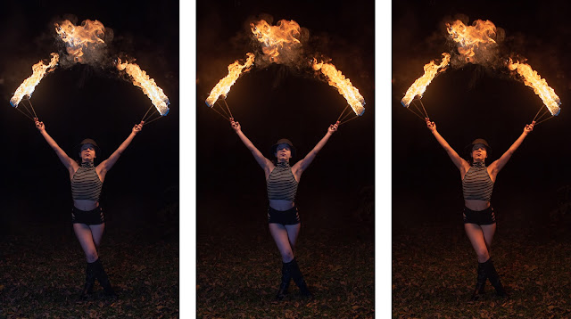 |
| Katriella with her fans. The left frame is cool, the right frame is warm, the middle frame is balanced. |
Here's an example. The only difference between these three frames is the white balance. The right frame probably more closely matches what your eyes would have seen at that moment; very warm with few hint of blues or any other colors; the white balance is set to 3250k (which nearly matches the auto white balance my camera chose). The left frame has had its white balance shifted down to 2500K, and everything looks cooler. You can see more of the blues at the heart of the flame, the skin tones on Katriella look more natural (i.e. less orange), etc. Each has a different feel, and it's all achieved with only one slider.
But the real secret sauce that I didn't truly understand until I started writing these 'blog posts is selective white balance***. Having the fire look warm, the performer look natural, and the whole image still look realistic means that certain parts of your image will have to be balanced differently than others. You can do this during the shoot with lighting (and I discussed that briefly towards the end of Part 1), or you can do it in editing. My preferred method for doing this in the edits is masking coupled with white balance, but you could also use tone curves or color grading tools.
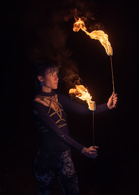 |
| Mia with her torches, nicely balanced. |
In the middle frame above, I set the white balance of the overall scene to 3250K, which gave me the warmer flames and smoke of right frame, but I masked off Katriella and adjusted the white balance down to produce more natural looking skin tones of the left frame. I also extended the mask to the background at 50% flow rate, so it is a bit cooler but not as much. To me, this produces a much more appealing image than simply adjusting the whole scene one way or another. I used a similar approach to balance out the photo of Mia here, but since I had some auxiliary LED lighting for this shot, the adjustments in the white balance mask didn't need to be as strong.
Wait, What About A Walkthrough?
I gave some thought to writing up a detailed, step-by-step walkthrough of how I edited one photo as an example for folks reading this, but I decided against it. Aside from being a whole lot more to write, I realize that everyone's brain works differently so everyone's thought process while editing is going to be different too. I don't want folks reading this to have to think like me, I just want to share some of what I've learned.
Conclusion
I have come to thoroughly enjoy fire photography. There is a chaotic energy to it that pushes me to go with the flow of the performance. It is a welcome break from my other styles of shooting, and it has taught me wondrous things. On top of that, the community of fire performers around where I live are simply an amazing group of people, and I couldn't have started myself on this journey if they hadn't all been so willing to let me capture moments of them on journeys of their own. In essence, fire photography has made me feel more connected; with my art, with my community, and with myself.
It's good stuff. I hope you try it.
If you don't already, feel free to look me up on Instagram and Twitter to catch up on my latest work or reach out with any questions about these posts or photography in general. And please check out all the performers I shared photos of in this post; I've linked to their social media accounts in the photo captions.
* Assuming the digital sensor isn't close to its saturation point. If it is, it will gradually stop reporting any additional light at all.
** This is a very, very simplified way to say this, and it is said specifically in the context of this post. Don't go quoting me out of context to other photographers unless you want to start a flame war.
*** This is one more reason to shoot RAW: much versatility in white balance control.
Comments
Post a Comment